Make your site truly mobile-friendly. A practical guide to mobile SEO: speed, Core Web Vitals, responsive design, testing tools, and quick wins to boost results.
We’ve all been there: trying to buy a ticket or check an address on our phone and the site fights us every step of the way. That’s the moment you realise mobile-friendliness isn’t a “nice to have” — it directly affects whether people stick around, convert, and come back.
Mobile now leads the way for browsing and buying. If your site doesn’t work beautifully on a small screen — fast, readable, tappable — users will bounce and search engines will notice.
This guide walks you through what matters, why it matters, and how to fix it without needing a degree in web dev.
Why Mobile SEO Matters

- Google indexes mobile first. Your mobile experience is effectively the version Google evaluates.
- User expectations are unforgiving. Slow pages and fiddly layouts cost you clicks, leads, and revenue.
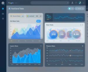
- Core Web Vitals affect visibility. Focus on:
-
- LCP (Largest Contentful Paint): how quickly the main content appears.
- INP (Interaction to Next Paint): responsiveness after the page loads.
- CLS (Cumulative Layout Shift): visual stability (no jumping buttons).
Get these right and you’ll improve both rankings and real-world performance.
Core Principles of a Mobile-Friendly Site
1)  Responsive design (no pinching, no sideways scrolling)
- Use a fluid, responsive layout with
meta viewportset correctly. - Avoid fixed-width elements; let images and containers scale.
- Test across common breakpoints (e.g., 320, 375, 414, 768, 1024px).
2) Speed as a feature, not an afterthought
- Compress and resize images; serve WebP/AVIF where possible.
- Lazy-load below-the-fold images and embeds.
- Minimise and defer non-critical JS; inline critical CSS for above-the-fold content.
- Use caching (page + browser) and a CDN for global speed.
- Keep third-party scripts lean (analytics, chat, widgets). If it doesn’t earn its keep, remove it.
3) Tap-friendly navigation and controls
- Make tap targets at least 44×44 px with generous spacing.
- Keep the primary menu simple, with clear labels; avoid deep nestings on mobile.
- Use sticky header or bottom nav sparingly — handy, but don’t let it eat the viewport.
4) Readable, scannable content
- Base font size ~16px minimum; line height ~1.5.
- Short paragraphs, H2/H3 sub-headings, lists, and whitespace.
- Avoid full-width walls of text; use images and dividers to break sections.
5) Forms that don’t frustrate
- Input types that trigger the right keyboard (email, number, etc.).
- Clear labels, minimal fields, visible errors, and simple validation.
- If checkout is long, break it into steps and show progress.
6) Pop-ups and banners: be considerate
- If you must use them, make them small, dismissible, and non-intrusive.
- Avoid interstitials that hide content as the page loads.
7) Media that behaves
- Make images responsive (
max-width: 100%) and set width/height attributes to reduce CLS. - Constrain video embeds and lazy-load them; provide a static thumbnail.
8) Structured data (for richer results)
- Use schema (e.g., Article, FAQ, HowTo, Product) where relevant.
- Ensure your mobile markup matches desktop content; keep it clean and valid.
9) Internal linking that helps humans
- Use concise, descriptive anchor text.
- Offer related links at natural points — don’t bury them in footers only.
To make things easier to digest, here’s a quick summary of the nine key principles of mobile SEO and the actions you can take for each:
| Principle | Key Actions |
|---|---|
| 1) Responsive Design | Fluid layouts, meta viewport tag, images and containers scale correctly across screen sizes. |
| 2) Page Speed | Compress images, lazy-load media, minimise scripts, enable caching and use a CDN. |
| 3) Easy Navigation | Clear menus, tap-friendly buttons (44x44px), simple checkout or conversion paths. |
| 4) Readable Content | Base font size ≥16px, short paragraphs, H2/H3 headings, lists, and effective use of whitespace. |
| 5) Forms | Mobile-optimised inputs (email, number, etc.), clear labels, minimal fields, step-by-step if long. |
| 6) Pop-ups | Keep them small, dismissible, and non-intrusive. Avoid blocking the page on load. |
| 7) Media | Responsive images (`max-width:100%`), set width/height to prevent layout shift, lazy-load videos. |
| 8) Structured Data | Use schema (Article, FAQ, HowTo, Product) consistently. Ensure mobile and desktop content match. |
| 9) Internal Linking | Concise, descriptive anchor text. Place related links naturally within content, not just in footers. |
Tools to Test and Improve (Simple, Free, Effective)
When it comes to mobile SEO, testing isn’t optional — it’s the only way to know if your improvements are actually working. The good news is that there are several free tools that give you clear, actionable insights:

- PageSpeed Insights (PSI): Combines lab and real-world (field) data, highlighting Core Web Vitals and offering prioritised fixes.
- Lighthouse (in Chrome DevTools): Runs audits for performance, accessibility, SEO, and best practices — a quick way to spot glaring issues.
- Search Console: Provides detailed reports on Core Web Vitals, mobile usability, and indexing problems, straight from Google.
- Chrome DevTools Device Mode: Lets you preview how your site looks and behaves across a range of screen sizes.
- Optional suites like SEMrush, Ahrefs, or Moz go deeper, but the three free tools above cover most essentials.
Tip: I always validate fixes in Lighthouse first (fast feedback) and then confirm improvements in Search Console, as that’s where the real-world data shows whether changes are paying off.
I’ve had my fair share of challenges with Core Web Vitals recently, and these tools were invaluable in helping me track down the root causes and work through them systematically. It’s easy to feel overwhelmed when metrics dip, but having clear data at your fingertips makes the process much more manageable.
Common Mobile Issues (and Fast Fixes)
Mobile SEO can feel like chasing moving goalposts — just when one thing’s sorted, another crops up. To save you the headache, I’ve pulled together the most frequent culprits and the fastest ways to fix them:
- Slow first render (poor LCP): Optimise hero image size/format, preload the hero asset, inline critical CSS, defer heavy scripts.
- Sluggish interactions (poor INP): Reduce JS bundles, split code, avoid long tasks, debounce scroll/resize handlers.
- Layout shifts (poor CLS): Always set width/height on images/ads; reserve space for embeds; avoid swapping fonts late.
- Tiny fonts/tap targets: Increase base font size, line spacing, and button touch areas; add spacing between links.
- Menus that overflow: Replace hover-based menus with tapable accordions or a clean slide-in menu.
A Quick Mobile SEO Checklist
Mobile SEO can get technical fast, but the fundamentals are surprisingly straightforward.
Use this quick checklist as a handy reference whenever you’re reviewing or updating your site:
📋 Quick Mobile SEO Checklist
- Responsive layout with correct viewport meta tag
- Core Web Vitals passing (LCP, INP, CLS)
- Images optimised (WebP/AVIF, lazy-load, proper dimensions)
- Minimal render-blocking CSS/JS; code split and defer where possible
- Tap targets ≥44×44 px; clear, simple mobile nav
- Base font ≥16px; short paragraphs; H2/H3 structure
- Lightweight, dismissible pop-ups (or none)
- Structured data valid and aligned with on-page content
- Tested across key devices and network speeds
- Improvements verified in Lighthouse and Search Console
Small Changes, Big Gains
Treat mobile SEO as ongoing housekeeping. Ship one improvement at a time, measure the impact, and keep going. The compound effect is real — a faster hero, a calmer layout, clearer buttons — and users feel it immediately.
❓ Ready to tune up your mobile experience? If you’d like a no-nonsense mini-audit, I can walk you through your Core Web Vitals, image setup, and mobile navigation — and give you a prioritised 10-point fix list you can action this week. Pop a comment below with your site URL (or use the contact page if you prefer) and I’ll point you to the quickest wins.
We hope you’ve found this guide useful — and if you’ve got any questions, don’t hesitate to leave a comment below.
FAQ Content
Q1. What is mobile-first indexing?
Mobile-first indexing means Google predominantly uses the mobile version of your site for ranking and indexing. If your mobile site isn’t optimised, it can directly affect your visibility in search results.
Q2. How can I test if my site is mobile-friendly?
You can use Google’s Mobile-Friendly Test, PageSpeed Insights, or Lighthouse to see how your site performs on mobile. These tools highlight issues like small text, poor tap targets, or slow load times.
Q3. What are Core Web Vitals, and why do they matter?
Core Web Vitals measure key aspects of user experience: Largest Contentful Paint (LCP), Interaction to Next Paint (INP), and Cumulative Layout Shift (CLS). Passing these metrics improves both rankings and user satisfaction.
Q4. How often should I review my site’s mobile performance?
Ideally, run tests every time you update your design, plugins, or theme. Even small changes can affect load speed, layout, or navigation, so a regular check keeps your site healthy.
Disclosure: Some of the links on this website may be affiliate links, which means we may earn a commission if you click on the link and make a purchase. However, please rest assured that we only recommend products or services that we genuinely believe in and use ourselves. Your support helps keep this website running and allows us to continue providing you with valuable content. Thank you for your support!


